- 9. 배경이미지 2022.06.26
- 8. box-sizing 2022.05.07
- 7. border-radius, background-color, box-shadow 2022.05.07
- 6. width, height, overflow 2022.05.07
- 5. border 2022.05.07
- 4. Margin, Padding 2022.05.07
background-repeat
이미지 반복시키는 여부 정하는 속성
/* 반복하지 않음 */
background-repeat: no-repeat;

/* 가로 방향으로만 반복 */
background-repeat: repeat-x;

/* 세로 방향으로만 반복 */
background-repeat: repeat-y;

/* 가로와 세로 모두 반복 */
background-repeat: repeat;

/* 반복할 수 있는 만큼 반복한 뒤, 남는 공간은 이미지 간의 여백으로 배분 */
background-repeat: space;

/* 반복할 수 있는 만큼 반복한 뒤, 남는 공간은 이미지 확대를 통해 배분 */
background-repeat: round;
background-size
배경 이미지의 사이즈를 정해주는 속성
/* 원래 이미지 사이즈대로 출력 */
background-size: auto;

/* 화면을 꽉 채우면서, 사진 비율을 유지 */
background-size: cover;

/* 가로, 세로 중 먼저 채워지는 쪽에 맞추어서 출력 */
background-size: contain;

/* 픽셀값 지정 (가로: 40px, 세로: 50px로 설정) */
background-size: 40px 50px;

/* 퍼센트값 지정 (가로: 부모 요소 width의 50%, 세로: 부모 요소 height의 70%로 설정) */
background-size: 50% 70%;
background-position
배경 이미지의 위치를 정해주는 속성
/* 단어로 지정해주기 (가로: left, center, right, 세로: top, center, bottom) */
/* 아래와 같은 총 9개의 조합이 가능 */
background-position: left top;
background-position: left center;
background-position: left bottom;
background-position: right top;
background-position: right center;
background-position: right bottom;
background-position: center top;
background-position: center center;
background-position: center bottom;

/* 퍼센트로 지정해주기 (가로: 전체 width의 25% 지점, 세로: 전체 height의 75% 지점 ) */
background-position: 25% 75%;

/* 픽셀로 지정하기 (가로: 가장 왼쪽 가장자리에서부터 오른쪽으로 100px 이동한 지점, 세로: 가장 상단 가장자리에서 아래로 200px 이동한 지점) */
background-position: 100px 200px;

부족하거나 잘못된 내용이 있을 경우 댓글 달아주시면 감사하겠습니다.
이 글에 부족한 부분이 존재할 경우 추후에 수정될 수 있습니다.
'CS > HTML CSS' 카테고리의 다른 글
| 8. box-sizing (0) | 2022.05.07 |
|---|---|
| 7. border-radius, background-color, box-shadow (0) | 2022.05.07 |
| 6. width, height, overflow (0) | 2022.05.07 |
| 5. border (0) | 2022.05.07 |
| 4. Margin, Padding (0) | 2022.05.07 |
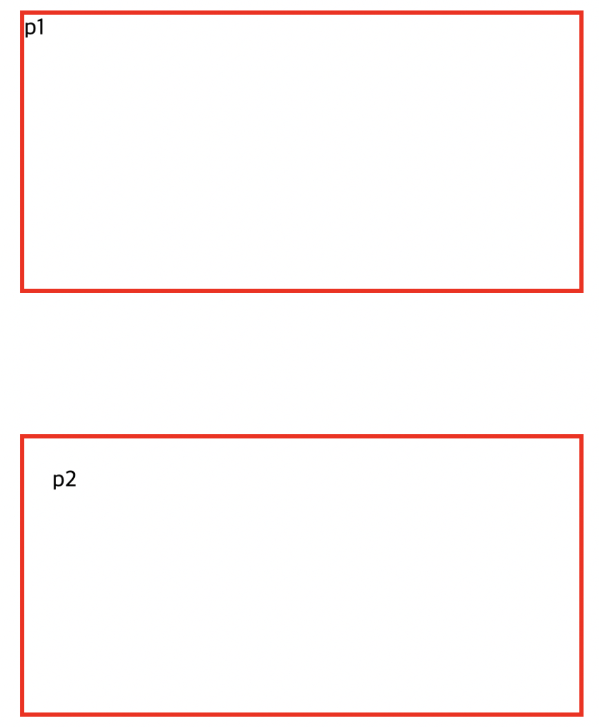
width와 height 속성은 border(테두리)와 padding을 제외한 content(내용물)의 크기만을 나타냅니다.
그래서 아래 코드를 실행해보면 p1과 p2의 크기가 다릅니다.
#p1 {
	border: 3px solid red;
	width: 400px;
	height: 200px;
	margin-bottom: 100px;
}

#p2 {
	border: 3px solid red;
	width: 400px;
	height: 200px;
	padding: 20px;
}

p1의 경우 가로는 406px이고 세로는 206px입니다.
p2는 가로 446px이고 세로는 246px입니다.
결국 가로 400px이고 세로 200px로 만들기 위해서는 border과 padding 속성을 다 계산하고 width, height 속성을 지정해야 하는 복잡한 문제가 생깁니다.
box-sizing
이러한 문제는 css3부터 box-sizing 속성을 사용해 해결할 수 있습니다.
box-sizing의 기본값은 content-box인데 이를 border-box로 바꿔 해결할 수 있습니다.
border-box값은 width와 height에 border, padding 의 값을 모두 포함한 길이가 됩니다.
#p1 {
	box-sizing: border-box;
	border: 3px solid red;
	width: 400px;
	height: 200px;
	margin-bottom: 100px;
}

#p2 {
	box-sizing: border-box;
	border: 3px solid red;
	width: 400px;
	height: 200px;
	padding: 20px;
}
그래서 많은 개발자들이 모든 요소에 box-sizing: border-box;를 쓰는 추세라고 합니다.
* {
	box-sizing: border-box;
}

부족하거나 잘못된 내용이 있을 경우 댓글 달아주시면 감사하겠습니다.
이 글에 부족한 부분이 존재할 경우 추후에 수정될 수 있습니다.
'CS > HTML CSS' 카테고리의 다른 글
| 9. 배경이미지 (0) | 2022.06.26 |
|---|---|
| 7. border-radius, background-color, box-shadow (0) | 2022.05.07 |
| 6. width, height, overflow (0) | 2022.05.07 |
| 5. border (0) | 2022.05.07 |
| 4. Margin, Padding (0) | 2022.05.07 |
border-radius
border-radius 속성을 통해 모서리를 둥글게 만들 수 있습니다.
p{
	border: 3px solid red;
	border-radius: 10px;
}
값이 커질 수록 더욱 둥글어집니다.
또한 각 모서리를 개별 설정할 수 있습니다.
p{
	border: 3px solid red;
	border-top-left-radius: 5px; /* 왼쪽 위 */
  border-top-right-radius: 10px; /* 오른쪽 위 */
  border-bottom-right-radius: 20px; /* 오른쪽 아래 */
  border-bottom-left-radius: 0px; /* 왼쪽 아래 */
}
background-color
background-color 속성을 통해 배경생을 지정할 수 있습니다.
p {
	background-color: rosybrown;
}

/* 전체 배경색 설정 */
body {
	background-color: gray;
}

/* 투명한 배경색은 transparent이고 기본값으로 설정됩니다. */
h1 {
	background-color: transparent;
}
box-shadow
box-shadow 속성을 통해 요소에 그림자를 지정합니다.
가로와 세로 위치를 설정해줘야 합니다.
p {
	width: 300px;
	height: 300px;
	box-shadow: 30px 60px;
}
box-shadow 속성에 색을 추가할 수 있다.
p {
	width: 300px;
	height: 300px;
	box-shadow: 30px 60px gray;
}
box-shadow 속성에서 색상 앞에 그림자를 얼마나 흐릴지 설정할 수 있다.
p {
	width: 300px;
	height: 300px;
	box-shadow: 30px 60px 10px gray;
}
그림자의 흐림 속성 뒤에 그림자가 얼마나 퍼질지도 설정할 수 있다.
p {
	width: 300px;
	height: 300px;
	box-shadow: 30px 60px 10px 15px gray;
}

부족하거나 잘못된 내용이 있을 경우 댓글 달아주시면 감사하겠습니다.
이 글에 부족한 부분이 존재할 경우 추후에 수정될 수 있습니다.
'CS > HTML CSS' 카테고리의 다른 글
| 9. 배경이미지 (0) | 2022.06.26 |
|---|---|
| 8. box-sizing (0) | 2022.05.07 |
| 6. width, height, overflow (0) | 2022.05.07 |
| 5. border (0) | 2022.05.07 |
| 4. Margin, Padding (0) | 2022.05.07 |
요소의 가로 길이(width)와 세로 길이(height)를 설정할 수 있다.
p {
	border : 3px solid red;
	width: 200px;
	height: 300px;
}
최소, 최대 길이
min-width, max-width, min-height, max-height 를 이용해서 가로, 세로의 최소, 최대 길이를 지정할 수 있다.
<!DOCTYPE html>
<html lang="ko">
<head>
  <meta charset="UTF-8">
  <title>Test</title>
  <style>
   #p1 {
     border: 3px solid black;
    max-width: 300px;
   }

   #p2 {
     border: 3px solid rebeccapurple;
     min-width: 500px;
   }

   #p3 {
     border: 3px solid red;
     max-height: 400px;
   }

   #p4 {
     border: 3px solid yellow;
     min-height: 600px;
   }
  </style>
</head>
<body>
  <!-- 가로 최대 길이: 300px -->
  <p id="p1">Lorem ipsum dolor sit amet consectetur adipisicing elit. Voluptates debitis pariatur omnis! Optio ipsa rem qui ratione natus, inventore illum sed minima, quibusdam aspernatur quia laboriosam reprehenderit dolores repellat nobis.</p>

  <!-- 가로 최소 길이 : 500px -->
  <p id="p2">Lorem ipsum dolor sit amet consectetur adipisicing elit. Amet fugiat, alias blanditiis, illo ea dolore soluta consequuntur quo fugit suscipit sunt excepturi expedita dolor assumenda vel maiores architecto numquam modi.</p>

  <!-- 세로 최대 길이 : 400px -->
  <p id="p3">Lorem, ipsum dolor sit amet consectetur adipisicing elit. Ipsa impedit cumque repellat temporibus atque quod blanditiis deserunt est quibusdam vitae. Nihil voluptatem illum voluptates cupiditate. Voluptas illo provident veniam quos!</p>

  <!-- 세로 최소 길이 : 600px -->
  <p id="p4">Lorem ipsum dolor sit amet, consectetur adipisicing elit. Blanditiis repellendus voluptates alias aspernatur accusamus, fugiat reprehenderit eveniet. Illo blanditiis cumque hic nihil alias dignissimos molestiae vel autem eligendi, similique quibusdam!</p>
</body>
</html>
이렇게 설정한 경우 내용물이 들어갈 공간이 부족한 경우가 있을 수 있다.
이때 사용할 수 있는 속성이 overflow이다.
overflow
visible
p {
	border: 3px solid red;
	max-width: 200px;
	overflow: visible;
}
내용물이 넘쳐도 그대로 보여준다.
hidden
p {
	border: 3px solid red;
	max-width: 200px;
	overflow: hidden;
}
넘치는 부분을 보이지 않게 한다.
scroll
p {
	border: 3px solid red;
	max-width: 200px;
	overflow: scroll;
}
항상 스크롤을 통해 볼 수 있게 한다.
auto
p {
	border: 3px solid red;
	max-width: 200px;
	overflow: auto;
}
내용물이 넘치는 경우에만 스크롤바를 보여준다.
부족하거나 잘못된 내용이 있을 경우 댓글 달아주시면 감사하겠습니다.
이 글에 부족한 부분이 존재할 경우 추후에 수정될 수 있습니다.
'CS > HTML CSS' 카테고리의 다른 글
| 8. box-sizing (0) | 2022.05.07 |
|---|---|
| 7. border-radius, background-color, box-shadow (0) | 2022.05.07 |
| 5. border (0) | 2022.05.07 |
| 4. Margin, Padding (0) | 2022.05.07 |
| 3. Box Model 기초 (0) | 2022.05.07 |
border : 테두리
<!DOCTYPE html>
<html lang="ko">
<head>
  <meta charset="UTF-8">
  <title>Test</title>
  <style>
    p{
      border-style: solid;
      border-color: aqua;
      border-width: 3px;
    }
  </style>
</head>
<body>
  <p>border Test</p>
</body>
</html>
이렇게 테두리의 속성을 하나씩 지정 가능하다.
border-style : 테두리 스타일
border-color : 테두리 색상
border-width : 테두리 굵기
한 줄로 작성
<!DOCTYPE html>
<html lang="ko">
<head>
  <meta charset="UTF-8">
  <title>Test</title>
  <style>
    #p1 {
      border: 3px dotted red;
    }

    #p2 {
      border: 3px dashed orange;
    }

    #p3 {
      border-top: 2px groove black;
      border-bottom: 10px dashed #494949;
      border-left: 3px dotted orchid;
      border-right: 3px double rosybrown;
    }
  </style>
</head>
<body>
  <p id="p1">border Test1</p>
  <p id="p2">border Test2</p>
  <p id="p3">border Test3</p>
</body>
</html>
이렇게 굵기, 스타일, 색 순서로 한 줄로 작성할 수 있다.
또한 #p3처럼 각각의 설정을 줄 수도 있다.
참고
<input>태그와 같이 기본적으로 테두리가 설정된 요소에 테두리를 없애고 싶으면
- border: none;
- border: 0;
이렇게 border 속성을 지정하면 된다.

부족하거나 잘못된 내용이 있을 경우 댓글 달아주시면 감사하겠습니다.
이 글에 부족한 부분이 존재할 경우 추후에 수정될 수 있습니다.
'CS > HTML CSS' 카테고리의 다른 글
| 7. border-radius, background-color, box-shadow (0) | 2022.05.07 |
|---|---|
| 6. width, height, overflow (0) | 2022.05.07 |
| 4. Margin, Padding (0) | 2022.05.07 |
| 3. Box Model 기초 (0) | 2022.05.07 |
| 2. 클래스, 아이디, 주석 (0) | 2022.05.06 |
요소 : 내용(content), 패딩(padding), 테두리(border)로 이루어져 있다.
Padding : 내용과 테두리 사이의 여유 공간
Margin : 요소 주위의 여백(테두리 밖의 공간)
Padding
padding을 주는 여러 가지 방법

<!DOCTYPE html>
<html lang="ko">
<head>
  <meta charset="UTF-8">
  <title>Test</title>
  <style>
    #p1 {
      border: 3px solid red;
      padding-top: 10px;
      padding-bottom: 30px;
      padding-left: 50px;
      padding-right: 70px;
    }

    #p2 {
      border: 3px solid blue;
      padding: 10px 50px 70px 20px;
    }

    #p3 {
      border: 3px solid green;
      padding: 20px;
    }

    #p4 {
      border: 3px solid black;
      padding: 20px 40px;
    }
  </style>
</head>
<body>
  <p id="p1">가장 직관적으로 padding 주는 방법</p>

  <p id="p2">padding 속성을 이용하면 순서는 위 오른쪽 아래 왼쪽 이다(시계방향)</p>

  <p id="p3">모두 같은 padding 속성을 주고 싶으면 그냥 padding에 값만 입력하면 된다</p>

  <p id="p4">좌, 우 값이 같고 위, 아래 값을 같게 주고 싶으면 padding 속성에 위, 아래 값(20px)을 주고 좌, 우 값(40px)을 주면 된다.</p>
</body>
</html>
Margin
margin 도 동일하다.
#p1 {
	border: 3px solid red;
	margin-top: 30px
	margin-bottom: 10px
	margin-left: 20px
	margin-right: 60px
}

#p2 {
	margin: 20px 40px 60px 80px
}

#p3 {
	margin: 30px
}

#p4 {
	margin: 20px 60px
}
가운데 정렬
<!DOCTYPE html>
<html lang="ko">
<head>
  <meta charset="UTF-8">
  <title>Test</title>
  <style>
   p {
     border: 3px solid black;
     width: 330px;
     margin-left: auto;
     margin-right: auto;
   }
  </style>
</head>
<body>
  <p>가운데 정렬은 margin을 auto로 설정해주면 된다.</p>
</body>
</html>

부족하거나 잘못된 내용이 있을 경우 댓글 달아주시면 감사하겠습니다.
이 글에 부족한 부분이 존재할 경우 추후에 수정될 수 있습니다.
'CS > HTML CSS' 카테고리의 다른 글
| 6. width, height, overflow (0) | 2022.05.07 |
|---|---|
| 5. border (0) | 2022.05.07 |
| 3. Box Model 기초 (0) | 2022.05.07 |
| 2. 클래스, 아이디, 주석 (0) | 2022.05.06 |
| 1. html/css 기본 태그 (0) | 2022.05.06 |